About
Display content sections with alternating left/right media placement. Ideal for storytelling, feature showcases, or company history sections.
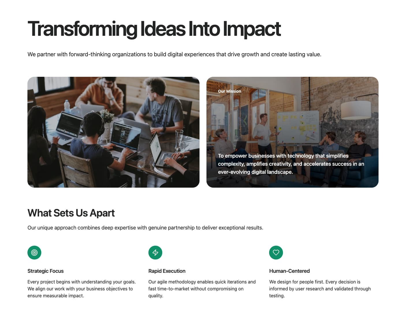
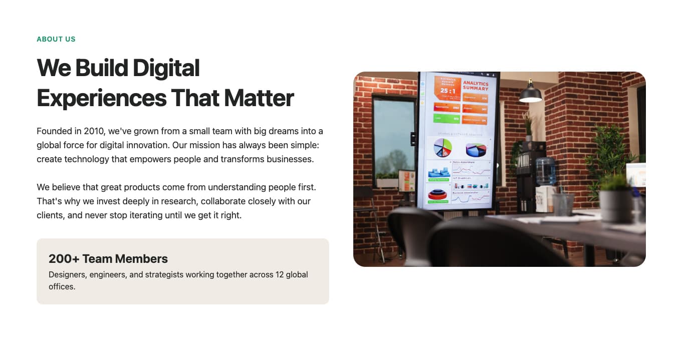
A mission-focused about section featuring a hero title, description, main image, mission statement with background image, and a grid of feature cards with icons. Ideal for company about pages that want to highlight their mission and core values.
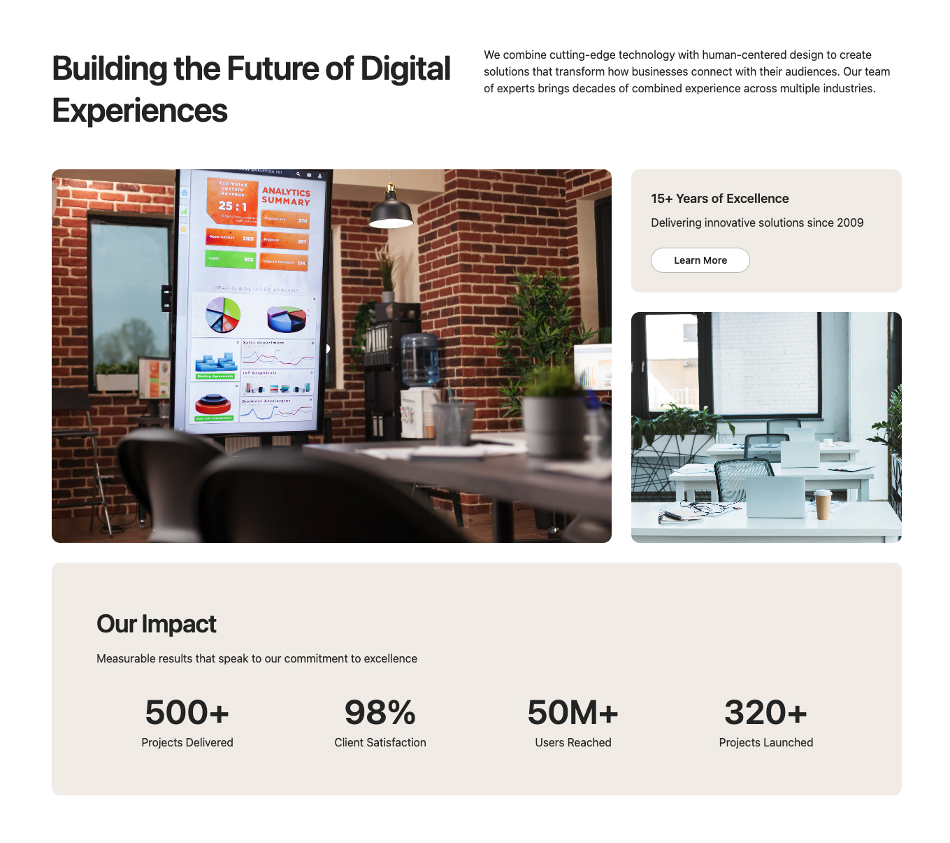
A comprehensive about section featuring a hero with image grid, statistics display, trusted company logos, and benefit cards with testimonials. Perfect for showcasing company achievements, social proof, and key metrics in a visually engaging layout.
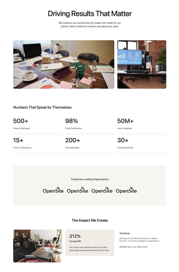
A company profile section with main image, breakout card with CTA, secondary image, trusted company logos, and an achievements section with key metrics. Ideal for corporate about pages that need to establish credibility and showcase accomplishments.
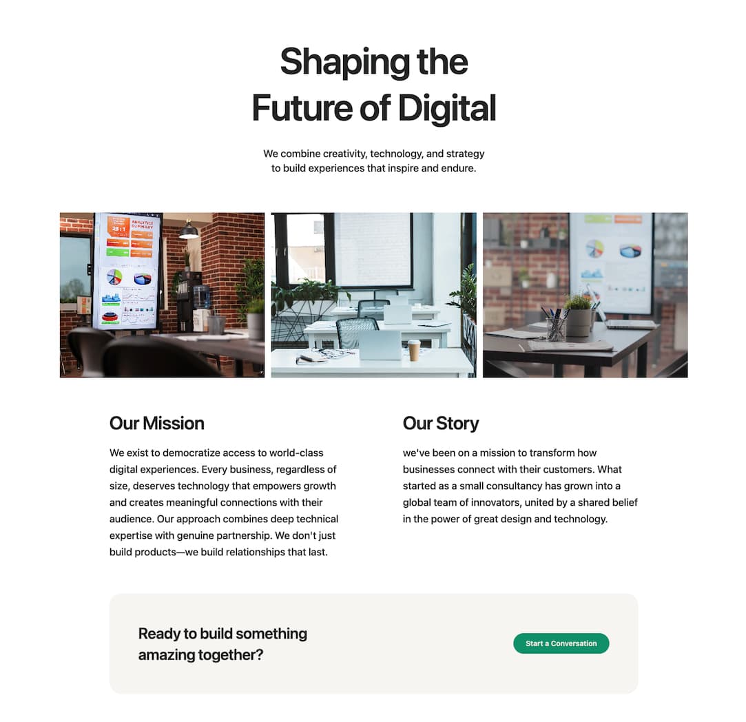
A vision-focused about section with hero title, image gallery grid, two-column vision/creators content, and a team CTA banner. Perfect for companies wanting to share their story, vision, and invite visitors to join their team.
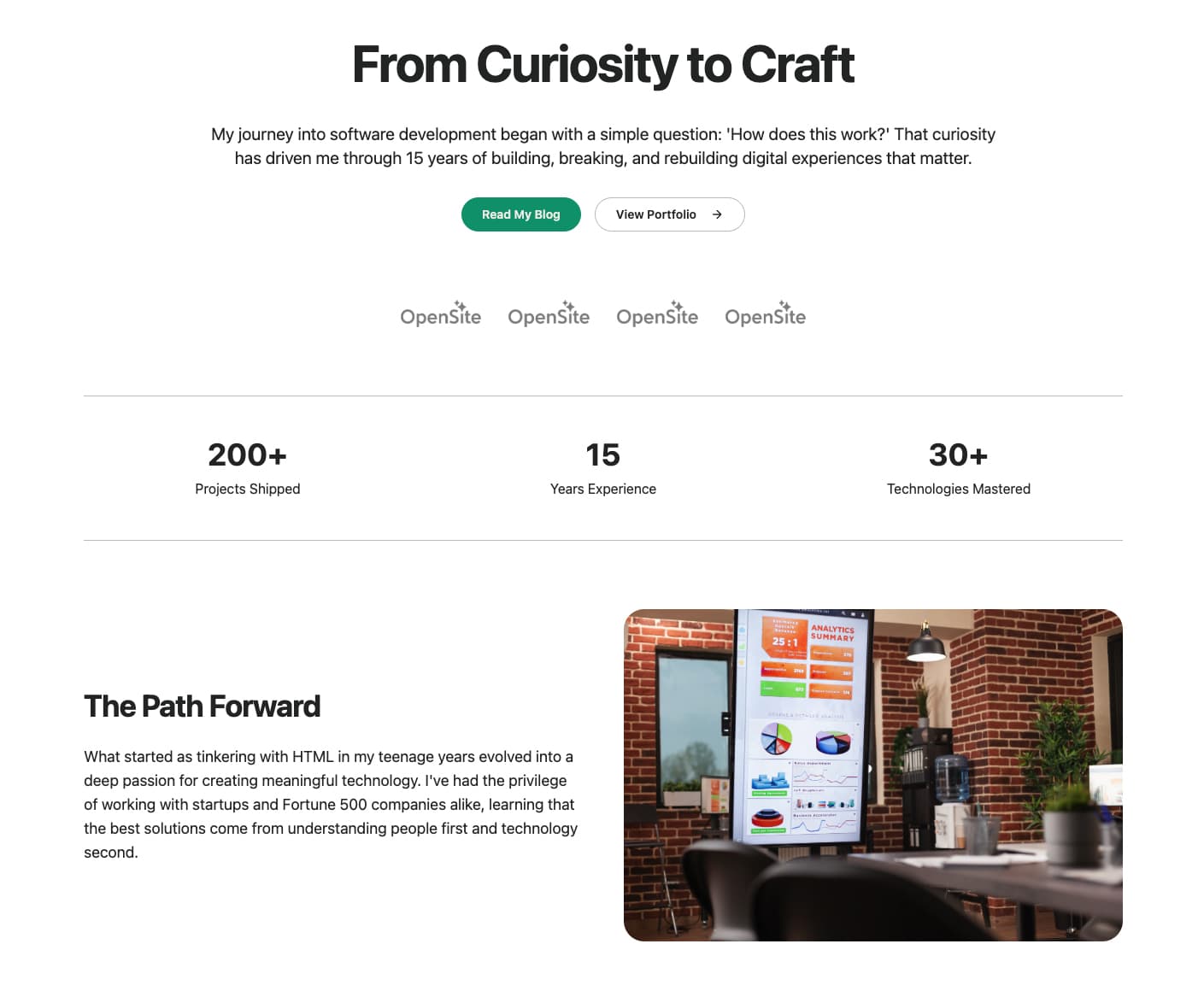
A developer-focused about section with hero title, dual CTAs, logo showcase, statistics bar, and a story section with image. Ideal for developer tools, SaaS platforms, and tech companies targeting technical audiences.
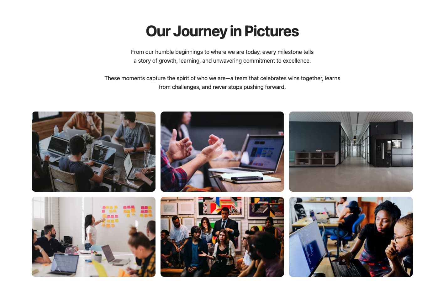
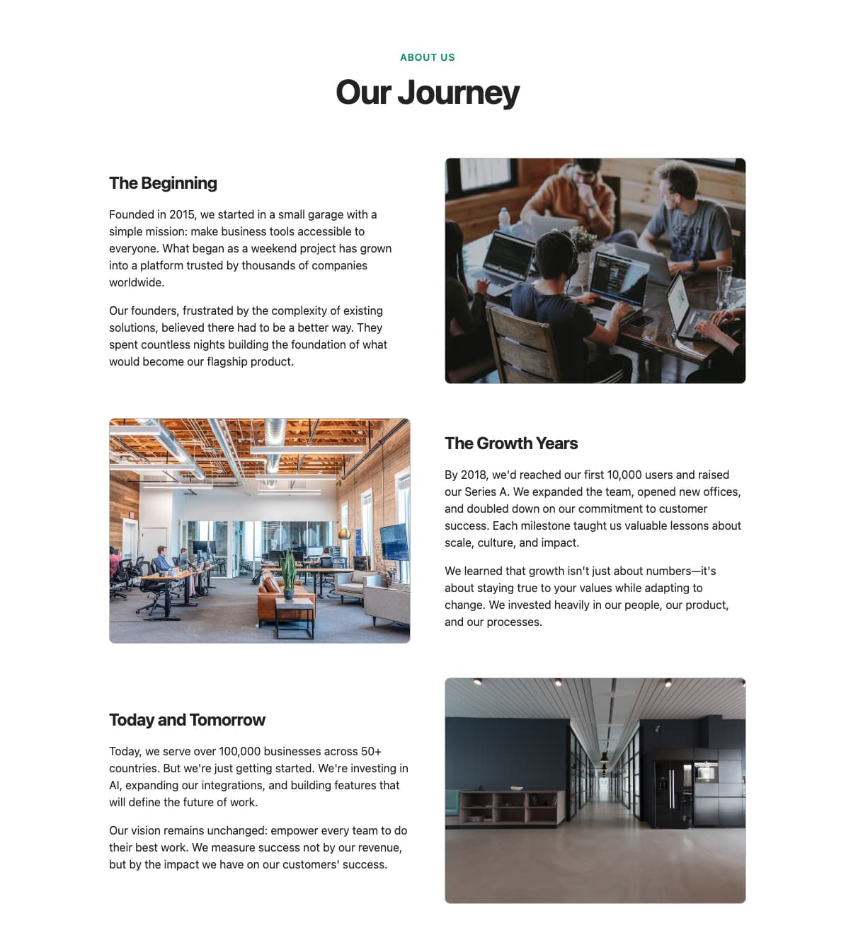
A minimal story section with centered title, descriptive content, and a multi-image gallery grid. Perfect for companies wanting to share their journey with visual storytelling in a clean, focused layout.
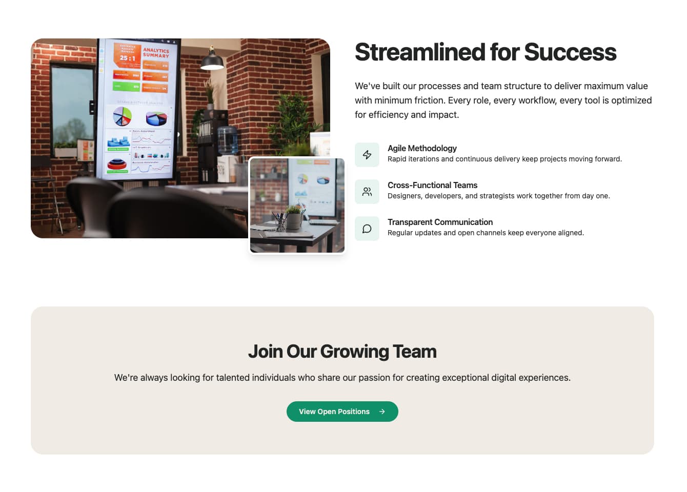
A streamlined about section with overlapping image layout, feature list with icons, and a team CTA banner. Ideal for showcasing workflow benefits and inviting visitors to join the team in a modern, visually appealing design.
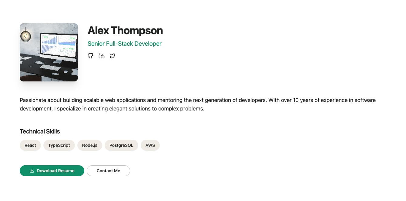
A developer portfolio-style profile section with avatar, name, role, social links, bio, skills tags, and contact CTA. Perfect for personal portfolios, team member spotlights, or founder profiles on company about pages.
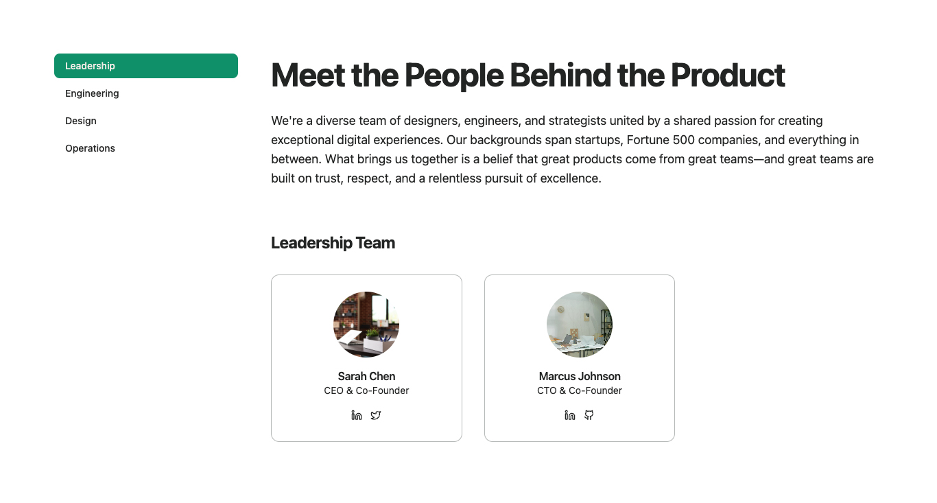
A SaaS startup-style about section with sticky sidebar navigation, main content area, and a team member grid with avatars and social links. Ideal for startup about pages that need organized navigation and team introductions.
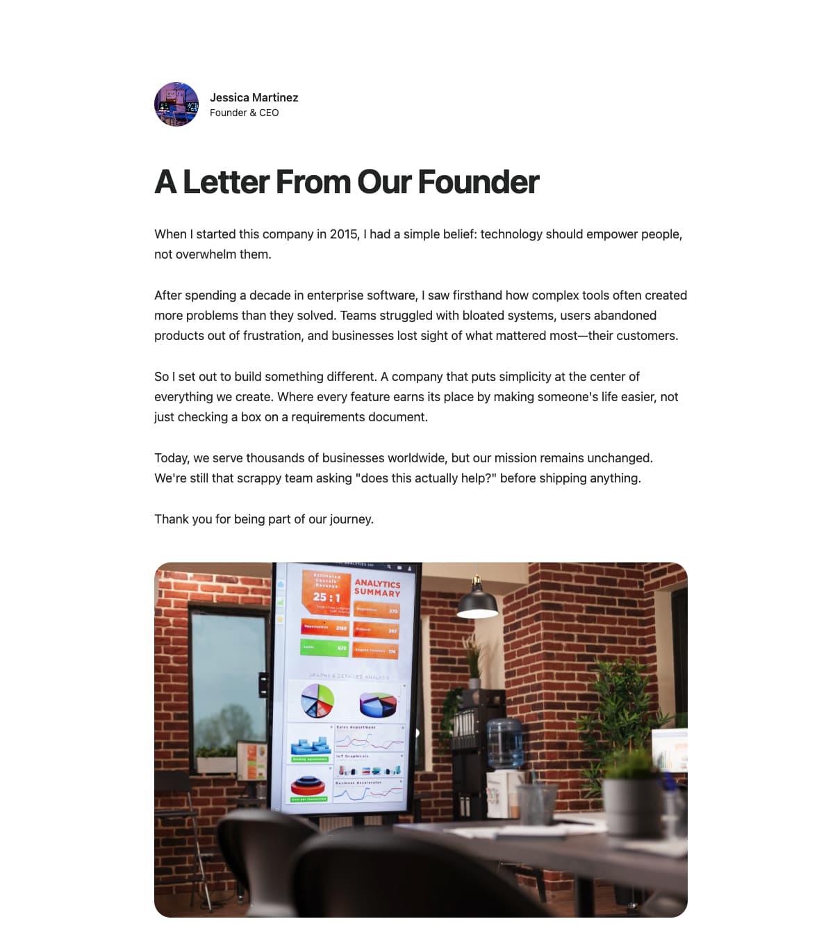
A minimal, author-focused story section with avatar, author info, title, narrative content, and optional featured image. Perfect for founder stories, company origin narratives, or personal brand about pages.
A story section with hero image, subtitle, title, narrative content, and team info card. Ideal for company story pages that want to combine visual impact with detailed narrative and team highlights.
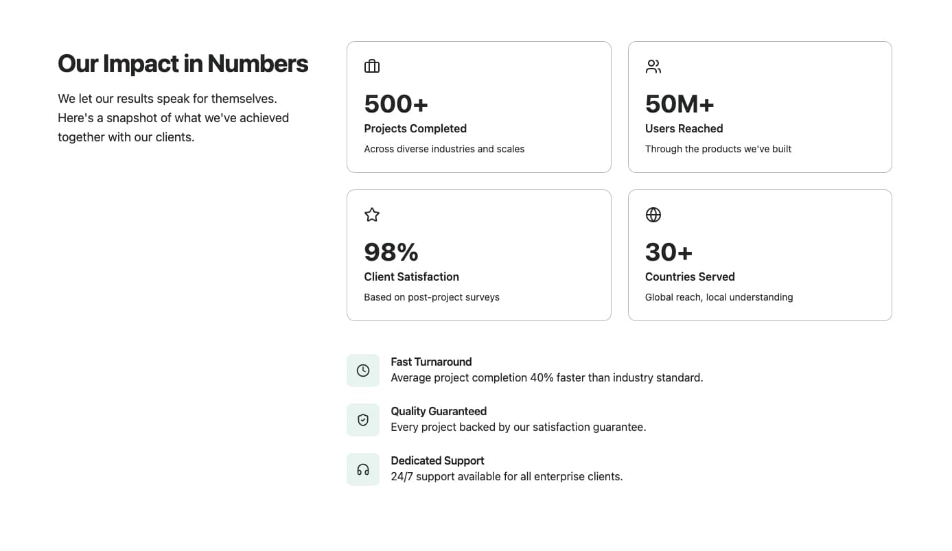
A stats-focused about section with sticky sidebar title/description, stats grid with icons, and feature list. Perfect for showcasing company metrics and key differentiators in a scannable, organized layout.
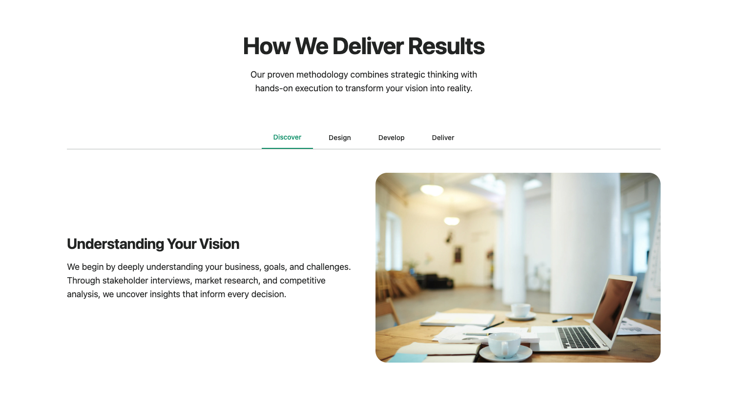
An interactive about section with tabbed navigation, dynamic content switching, and optional images per tab. Ideal for showcasing multiple aspects of a company (work, process, values) in an engaging, space-efficient format.
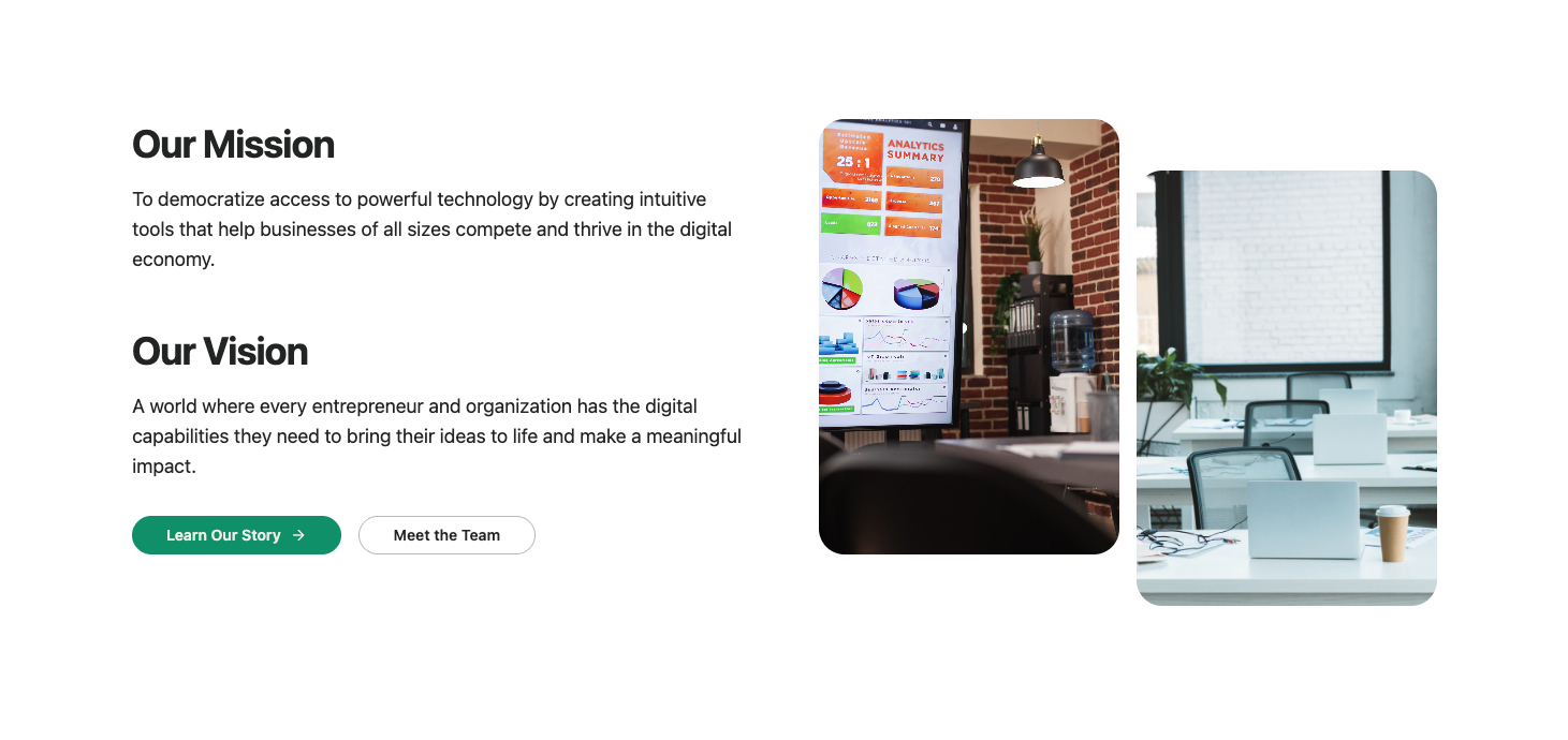
A mission/vision section with dual content blocks, CTA button, and a two-column image layout with offset positioning. Perfect for companies wanting to clearly communicate their mission and vision with strong visual support.
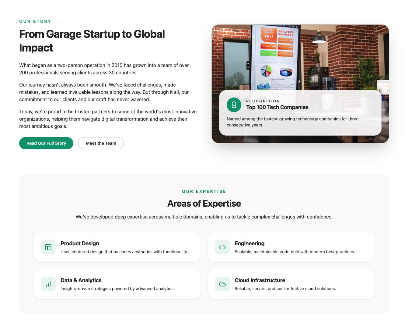
A two-part about section that pairs a narrative story with CTA buttons alongside a highlighted image card, followed by a grid of expertise tiles. Ideal for trust-building pages that need both brand story and capability proof points.
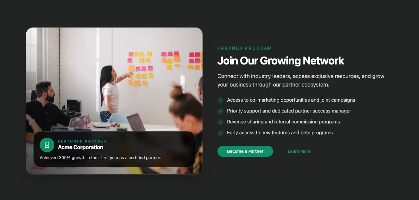
A high-contrast, two-column spotlight with a featured image overlay card, highlight list, and dual CTAs. Great for partner network invitations, alliance announcements, or community programs.
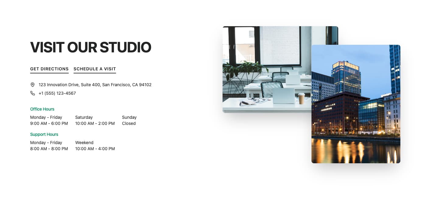
A split hero section with headline, action links, contact details, hours breakdown, and a one- or two-image showcase. Ideal for service hubs, flagship offices, or location-driven about pages.
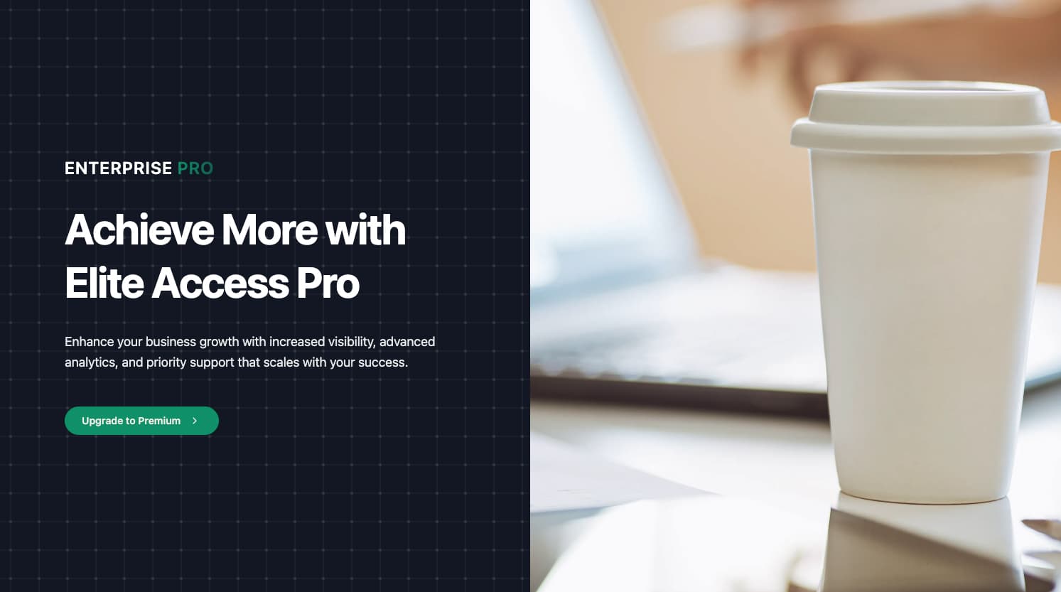
A split-screen hero section with dark theme styling, featuring text content on the left and a large image on the right. Includes brand text with gradient highlight, prominent heading, description, and CTA button. Best for premium/pro tier landing pages, product launches, and upgrade prompts.
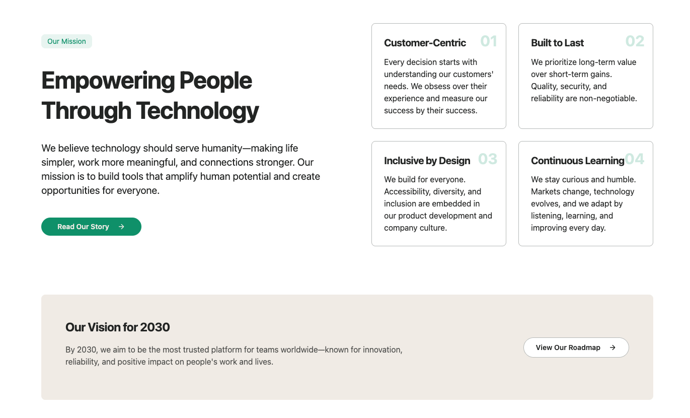
A comprehensive mission statement section with numbered principle cards and a vision callout. Features a two-column grid with mission text on left, principle cards on right, followed by a full-width vision banner. Best for company about pages, mission statements, and values showcases.
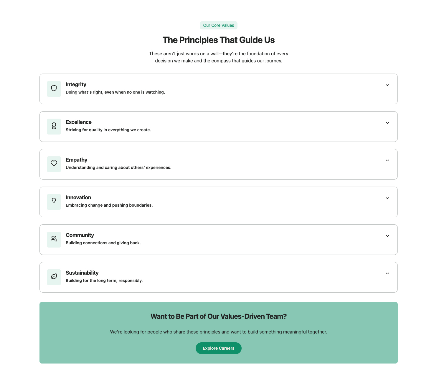
An interactive values section with expandable cards that reveal detailed descriptions and examples when clicked. Features a responsive grid of value cards that expand to full width when active, with icon integration and example lists. Best for company values pages, culture showcases, and brand identity sections.
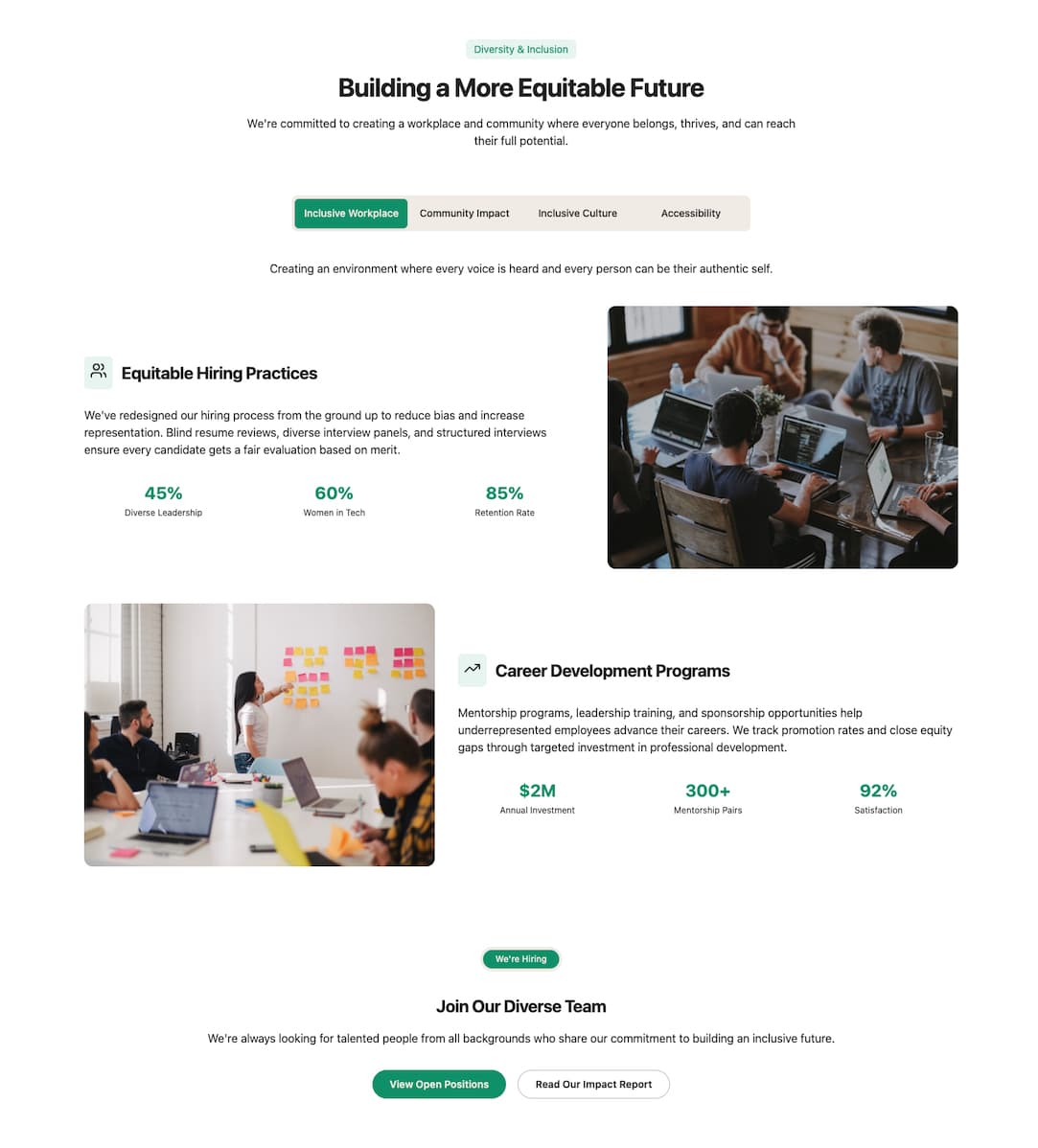
A comprehensive community impact section with tabbed categories and detailed initiative cards with metrics. Features a tabbed interface with alternating content/image layout for initiatives, metrics display, and responsive dropdown for mobile. Best for community impact pages, corporate responsibility sections, and values showcases.
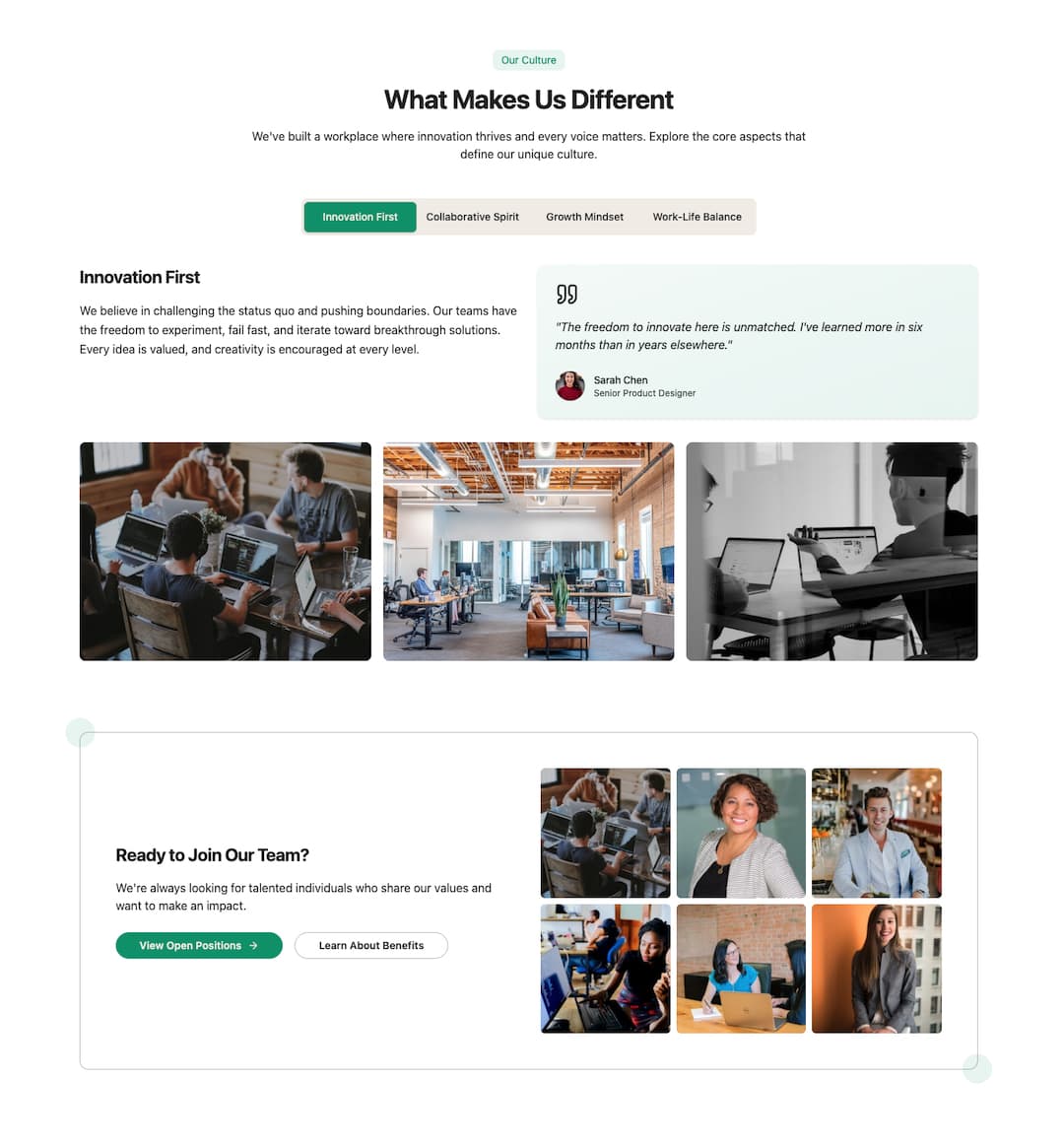
A tabbed company culture section with testimonials, image galleries, and a careers CTA. Features a tabbed interface with description, testimonial card, and image grid for each culture aspect. Best for company culture pages, careers sections, and about us pages.