Blog
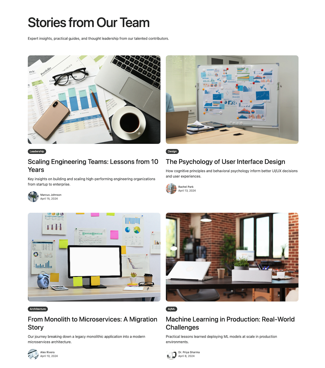
A responsive grid layout displaying content items with author attribution, category badges, and metadata. Features a 3-column grid on large screens with hover effects on images. Ideal for content listing pages that emphasize author information and categorization.
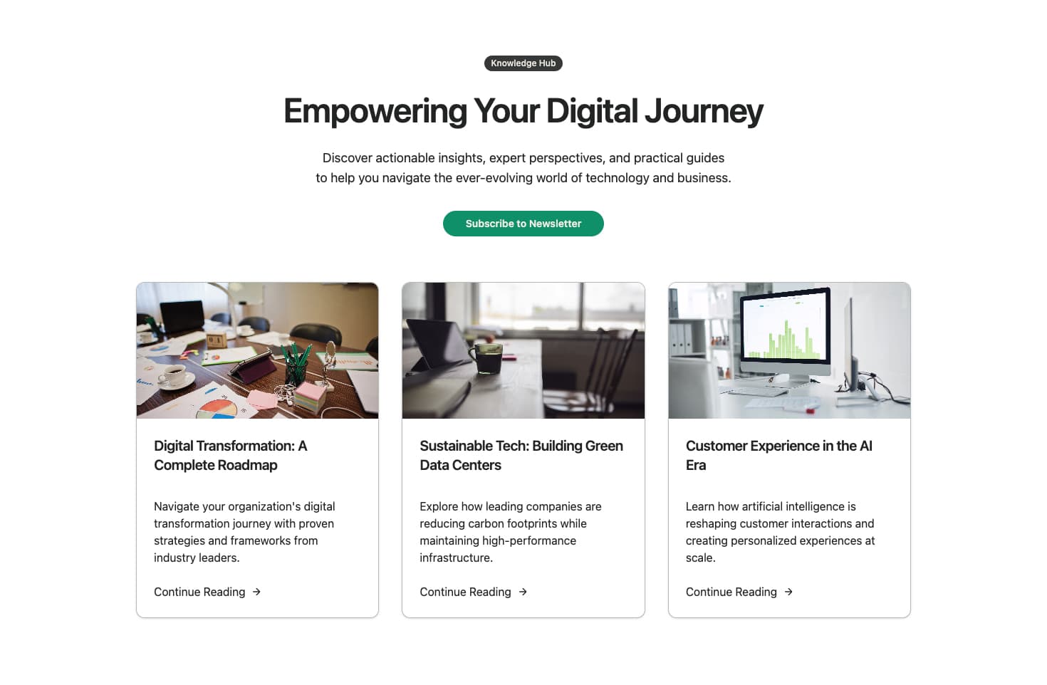
A centered content section with tagline badge, heading, description, and CTA button above a 3-column card grid. Each card features an image, title, summary, and action link. Perfect for marketing-focused content sections that need a strong call-to-action alongside item previews.
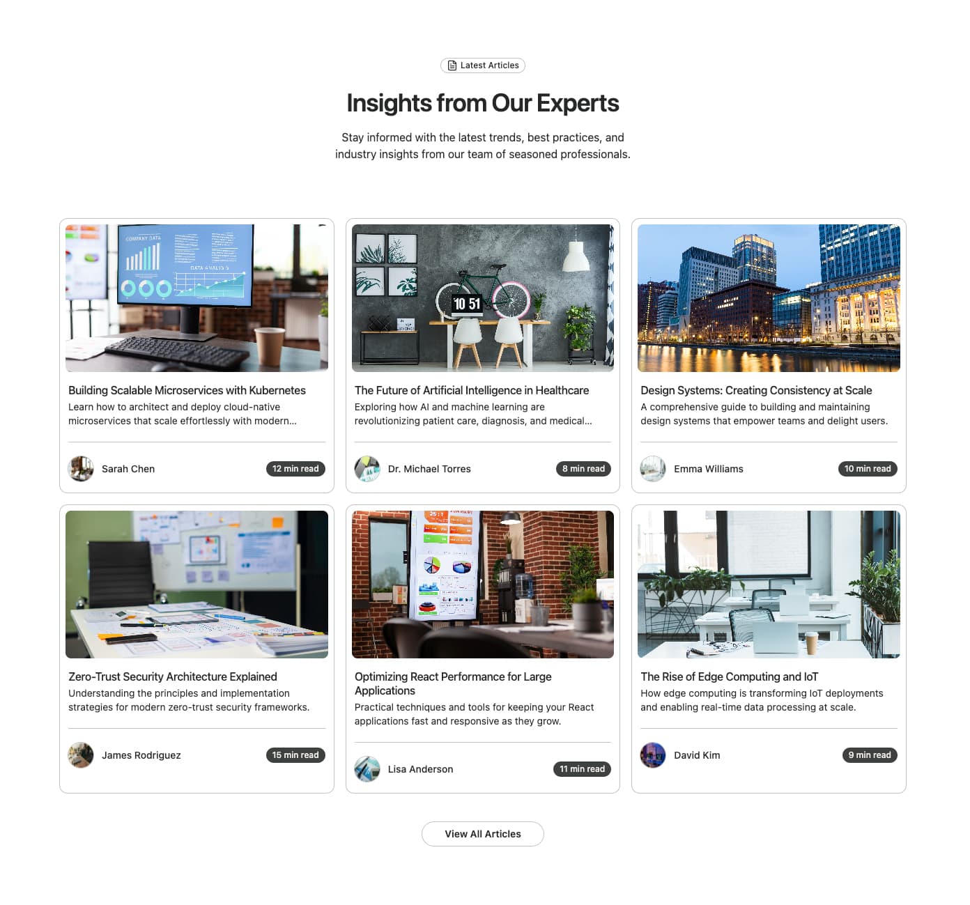
A blog card grid featuring author avatars, read time badges, and separator lines. Each card displays an image, title, summary, author info, and estimated reading time. Includes a centered header with icon badge and 'View All Blogs' CTA button. Ideal for content-heavy blogs that want to show reading commitment upfront.
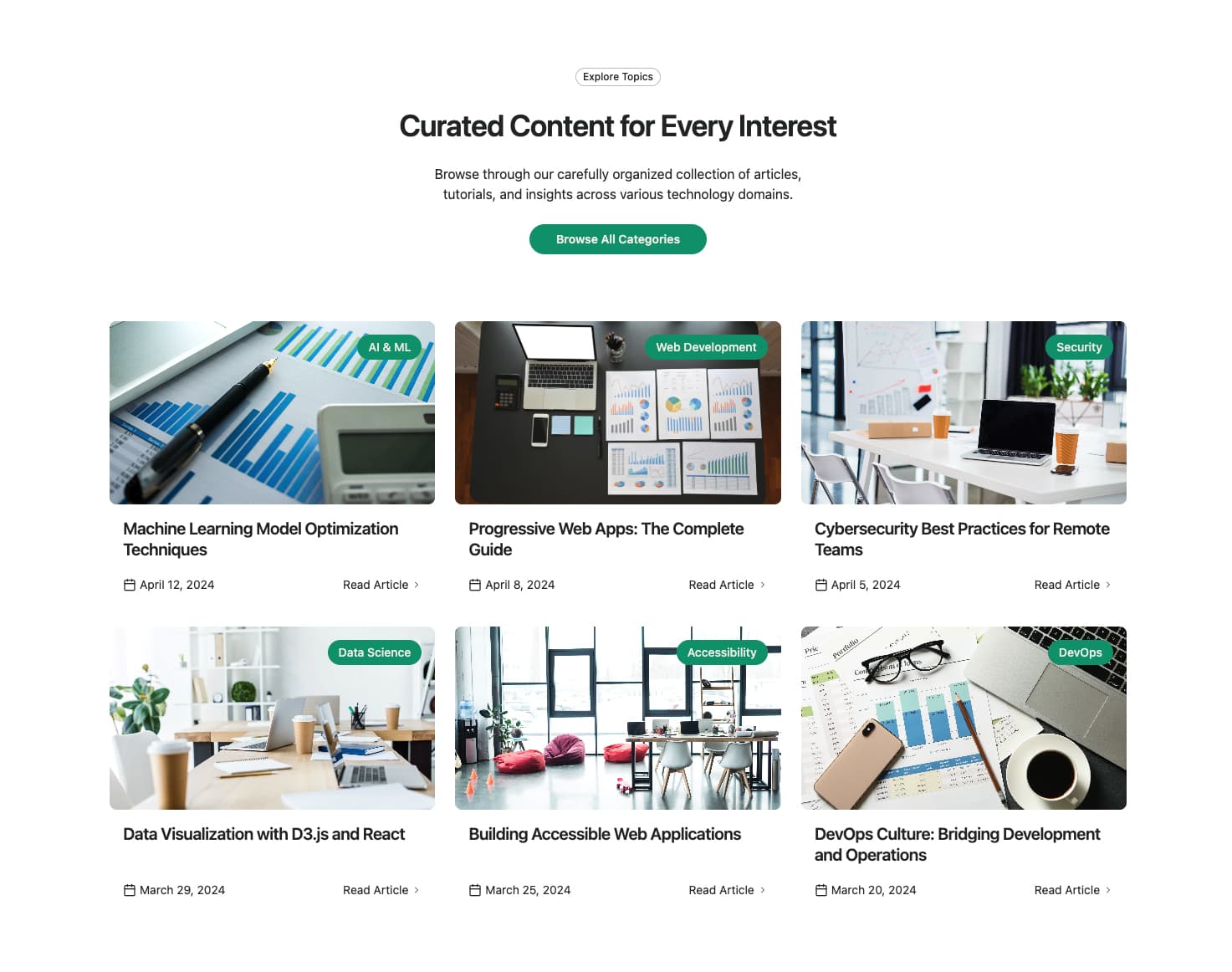
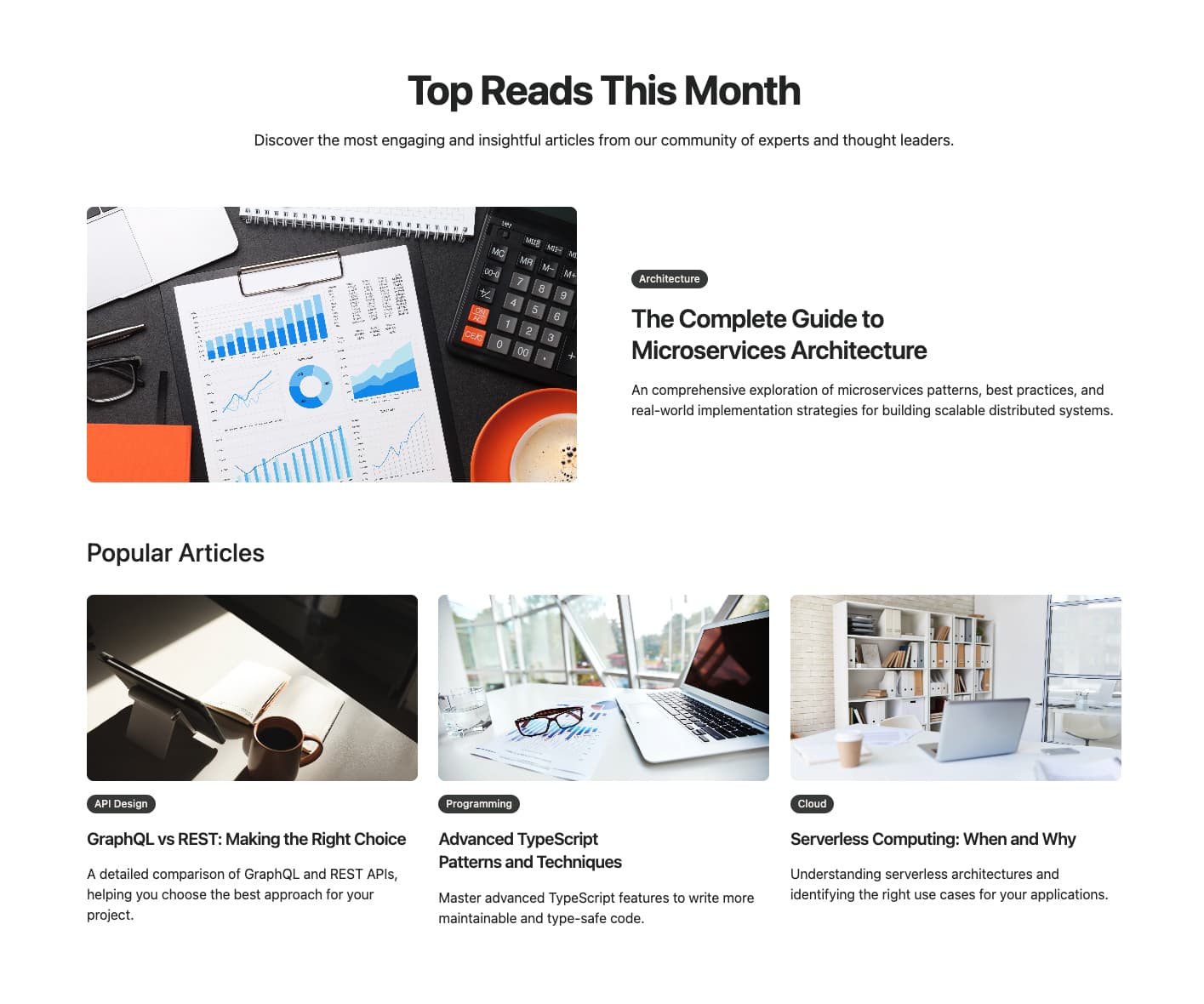
A content grid with category badges overlaid on images using a glassmorphism effect. Features a centered header section with badge, heading, description, and optional action link. Each card shows the item image, category overlay, title, date with icon, and optional action link. Great for visually categorized content with modern styling.
A two-tier content layout with a large featured item at the top and an additional content grid below. The featured item displays side-by-side image and content on desktop. Additional items show in a 3-column grid with images, category badges, titles, and descriptions. Renders only provided content without any defaults. Perfect for highlighting primary content alongside secondary content collections.
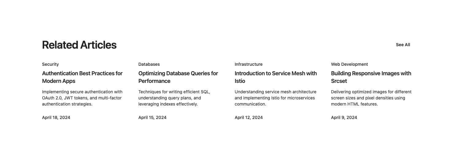
A compact related articles section with a 4-column grid layout. Each article displays category, title, description, and date in a text-only format without images. Features a header with title and 'See all' button. Ideal for sidebar widgets or end-of-article related content suggestions.
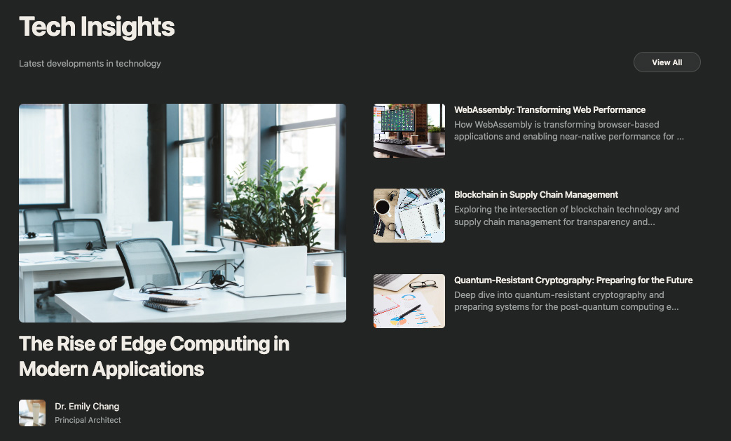
A dark-themed content section with a featured item and secondary items list. The featured item displays a large image with title and author info. Secondary items appear in a bordered list with thumbnails and content snippets. Includes a header with title, description, and primary CTA button. Perfect for content-focused layouts with a modern, professional aesthetic.
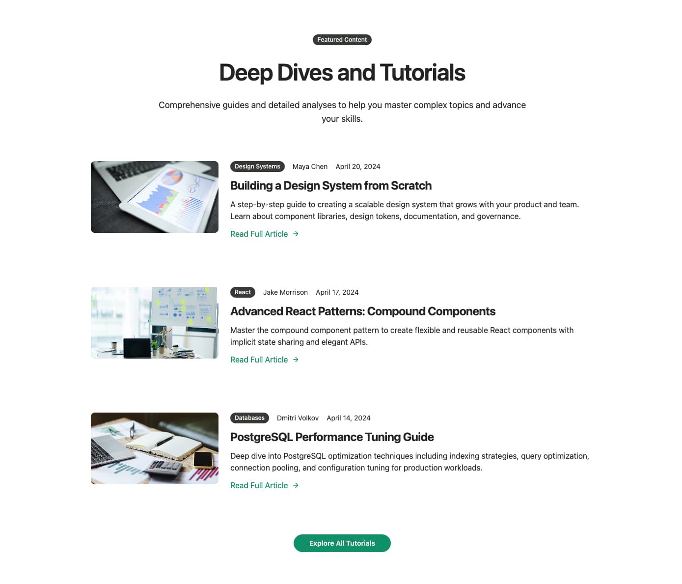
A content layout with horizontal card orientation featuring side-by-side image and content. Each card displays a thumbnail, category badge, author, date, title, summary, and 'Read more' link. Includes a centered header with optional badge, heading, and description, plus a bottom CTA button. Ideal for content-rich layouts that need more space for item summaries.
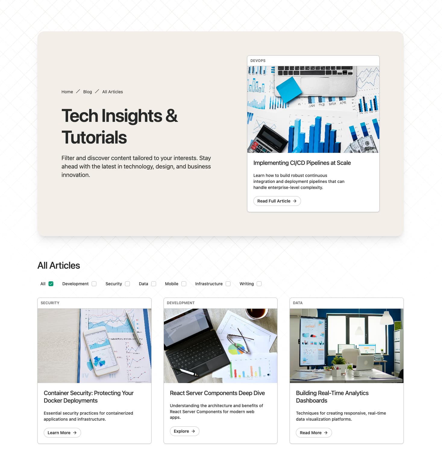
A comprehensive content listing page with breadcrumb navigation, featured primary item, category filtering, and paginated results. Features a muted background header section with title, description, and primary item card. The main section includes checkbox-based category filters and a pagination button. Perfect for full content listing pages with advanced filtering capabilities.
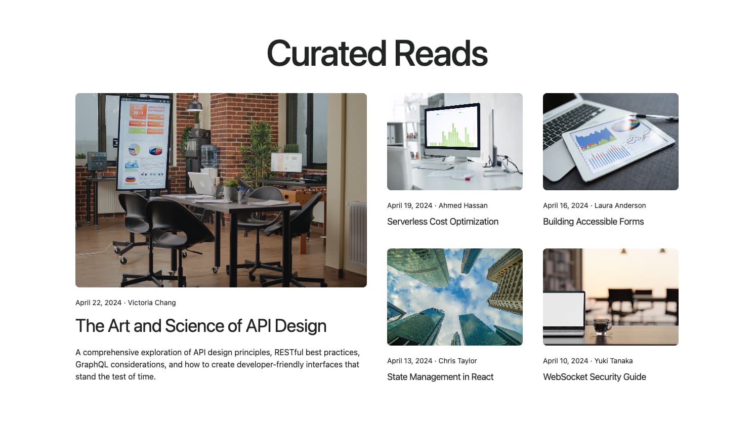
A masonry-style grid with a large featured item spanning two columns and rows, surrounded by smaller item cards. The featured item includes a full description while secondary items show only title and metadata. Features a centered heading and hover effects on media. Ideal for visually dynamic layouts that highlight a primary content piece.
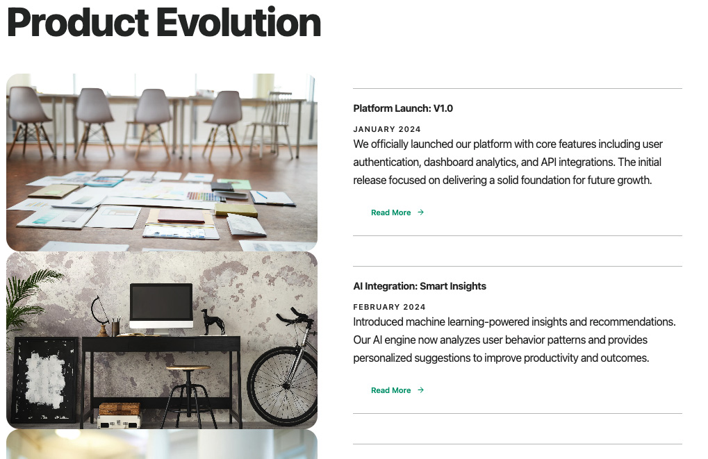
A timeline-style layout with large images alongside content cards in a horizontal arrangement. Each item features a rounded image, title, uppercase date, description, and animated action button with arrow icon. Items are separated by borders creating a timeline effect. Perfect for chronological content presentation or editorial storytelling.
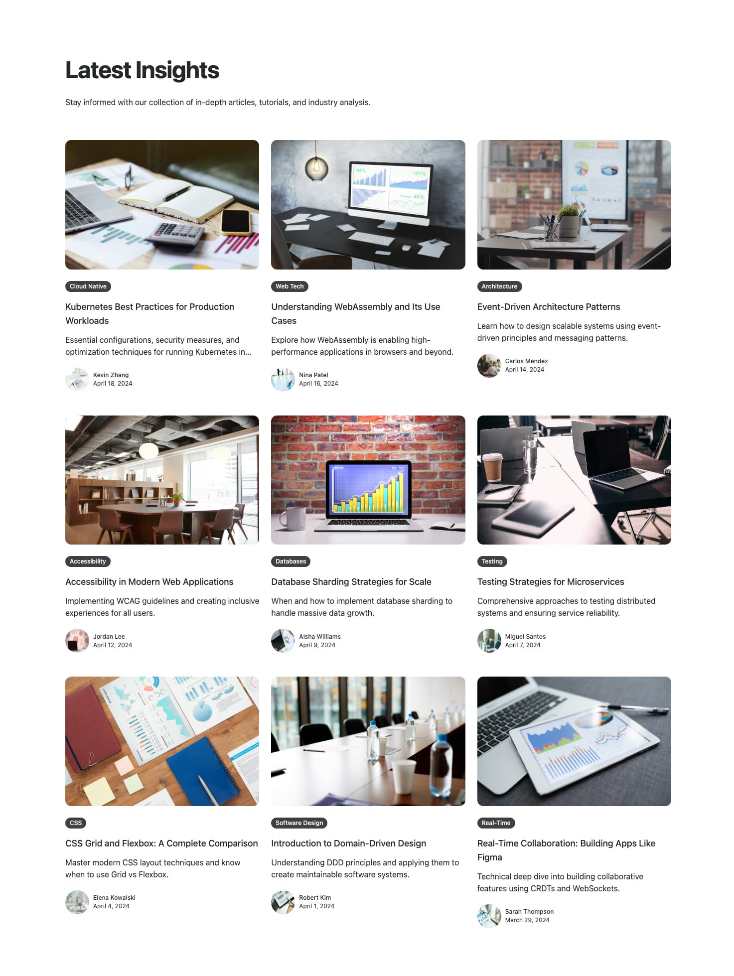
A comprehensive content grid layout displaying multiple items with author avatars, category badges, and publication dates. Features a 3-column grid on large screens with hover effects on images. Includes a mobile-only CTA button at the bottom. Ideal for content archive pages that need to display many items at once with full author attribution and content categorization.
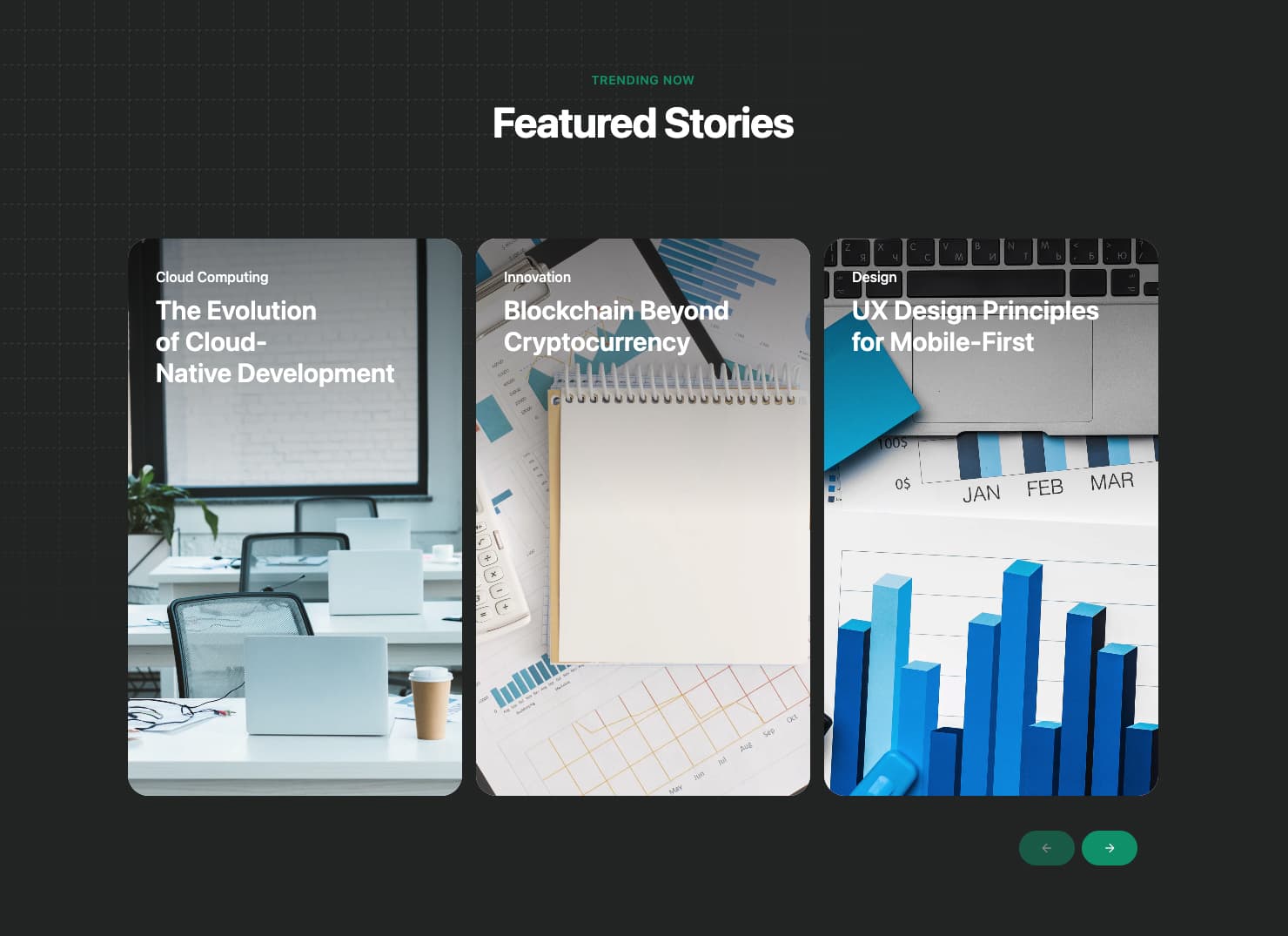
An eye-catching horizontal carousel featuring Apple-style cards with gradient overlays and smooth animations. Each card displays a featured image, category tag, and title with configurable action types (link, dialog, lightbox). Features optional layout animations and supports custom click handlers. Perfect for showcasing featured content items, latest updates, or curated content collections with a premium, polished aesthetic.