Hero

A background-image hero with a centered badge, headline, dual CTAs, and a grid of icon cards for quick navigation. Ideal for service-focused landing pages that need both narrative impact and fast access to top offerings.
A two-column hero with heading, description, and CTAs on the left, plus stacked icon cards on the right. Perfect for highlighting key benefits or service pillars in a quick, scannable layout.
A centered hero with decorative swirl lines and floating image accents around the headline. Great for lifestyle, hospitality, or brand-forward landing pages that need a playful visual tone.
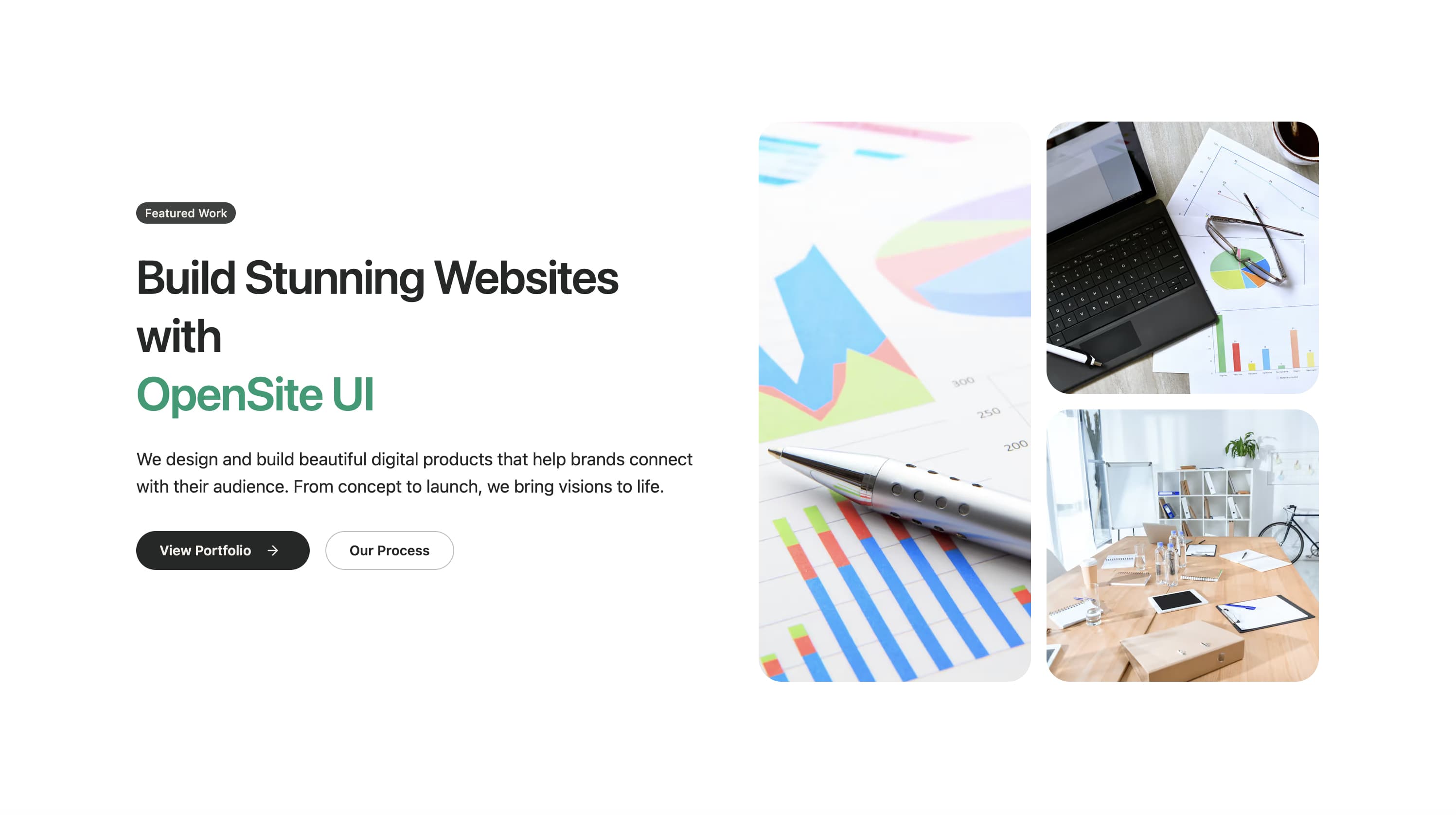
A split-layout hero section with a badge, headline, description, and CTA buttons on the left, and a large featured image on the right. Includes a logo bar showing trusted companies. Perfect for SaaS products and business landing pages.
A hero section with a large image on the left and content on the right, featuring headline, description, and CTA buttons. Great for showcasing products or services with visual emphasis.
An immersive hero that layers headline content over a rotating image slider. Ideal for storytelling or product showcases where multiple visuals should share the spotlight.
A centered hero section with headline and description above a grid of images. Ideal for portfolios, galleries, or showcasing multiple products or team members.
A centered hero with headline, description, and CTA buttons above a large product screenshot. Perfect for SaaS products, apps, and software landing pages.
A hero section with a decorative background pattern, badge, headline, and a row of trusted company logos. Great for establishing credibility and trust.
A centered hero featuring a logo, headline, description, and a large centered screenshot. Includes trusted company logos below. Ideal for product launches.
A hero section with a background pattern, logo, headline, and a visual display of technology stack icons. Perfect for developer tools and technical products.
A hero section featuring an announcement badge at the top, followed by headline, description, and CTA buttons. Great for product launches and announcements.
A hero section with a carousel of technology logos or partner brands. Features headline, description, and auto-scrolling logo carousel. Perfect for showcasing integrations.
A minimal centered hero with headline, description, CTA buttons, and a single featured image below. Clean and straightforward design for any landing page.
A hero section showcasing platform features in a grid layout with icons and descriptions. Includes headline and CTA. Perfect for feature-rich products.
A creative hero with a spiral background pattern and floating feature cards. Unique visual design for creative agencies and innovative products.
A split-layout hero with content on one side and decorative spiral shapes on the other. Artistic and modern design for creative businesses.
A split-layout hero featuring geometric shapes and patterns alongside content. Modern and professional design for tech companies.
A hero section focused on community engagement with a survey or feedback CTA. Includes headline, description, and prominent call-to-action for user participation.
A hero section with scattered product images creating a marketplace feel. Dynamic layout showcasing multiple items or categories.
A hero with a badge, headline, and content overlaid on a shadowed background image. Creates depth and visual interest for impactful landing pages.
A dark-themed hero with a video background, headline, and CTA buttons. Creates an immersive experience for media-rich landing pages.
A hero section with a grid pattern background emphasizing efficiency and productivity. Clean design for business and productivity tools.
A hero with dashed border decorations and feature highlights. Unique visual style that draws attention to key features.
A portfolio-style hero with a carousel showcasing design work or projects. Perfect for creative agencies and designers.
A hero with gradient background focused on client success stories or testimonials. Builds trust through social proof.
A premium split-layout hero featuring user avatars and social proof. Shows real users to build credibility and trust.
A hero designed to showcase UI components or design systems. Features component previews and documentation links.
A fullscreen hero with a background image, overlay, and centered content. Creates an immersive first impression.
A fullscreen hero featuring a prominent logo and call-to-action. Minimal and focused design for brand-centric landing pages.
A hero with gradient background, user avatars, and star ratings. Combines visual appeal with social proof elements.
An animated hero featuring a task timer or countdown element. Dynamic and engaging for productivity apps.
A hero showcasing AI-powered features with a carousel of capabilities. Perfect for AI products and machine learning tools.
A hero designed for advertising and marketing services. Features campaign metrics and expert positioning.
A flexible hero with an adaptable product grid layout. Showcases multiple products or features in a responsive grid.
A split-layout hero with video content on the right and presentation platform messaging on the left. Ideal for video conferencing and presentation tools.
A hero with grid pattern background and centered content showcasing business solutions. Professional design for B2B services.
A streamlined hero for CRM and sales tools. Features split layout with product image and CRM-focused messaging.
A hero for billing and payment platforms featuring trusted company logos in a carousel. Builds trust for fintech products.
A hero focused on software growth with a video dialog modal. Features scattered images and growth-focused messaging.
A conversion-focused hero with a prominent video play button and brand logos. Designed to drive engagement and conversions.
A hero showcasing design work with trusted design team logos. Perfect for design agencies and creative studios.
A hero with video overlay, star rating, and testimonial. Combines video content with social proof elements.
A hero for productivity apps with video background and download buttons. Features app store badges and launcher-style design.
A hero for hiring platforms with animated rotating text. Dynamic design that showcases different job roles or skills.
A split-layout hero with image and newsletter signup form. Perfect for content creators and newsletter-focused businesses.
A centered hero with gradient background and prominent CTA. Features highlight badges and feature callouts.
A hero featuring prominent statistics and social proof elements. Includes dashboard image and key metrics display.
A hero with feature cards arranged in a grid layout. Each card has an icon and description for key features.
A hero combining testimonials with an image grid layout. Shows customer feedback alongside visual content.
A hero showcasing design systems with 3D perspective images. Modern and innovative design for design tool products.
A fullscreen hero with architecture or real estate imagery. Features overlay content for property or construction businesses.
A hero focused on innovation with an image grid layout. Showcases innovative products or research visually.
A hero with gradient background and video dialog modal. Combines visual appeal with video content engagement.
A minimal dark-themed centered hero with beta badge. Clean and focused design for product launches.
A hero with floating stats cards around a product showcase. Dynamic design highlighting key metrics and features.
A hero featuring a SaaS dashboard preview with email signup. Perfect for software products showing their interface.
A hero for therapy and wellness services with testimonial grid. Features calming design and client feedback.
A dark-themed hero showcasing mental health professionals. Features team images and supportive messaging.
A split-layout hero for mentorship platforms with video preview. Features career growth messaging and video CTA.
A hero with mosaic image layout for business operations. Features asymmetric grid and professional messaging.
A hero for agencies with animated image transitions. Dynamic visual design showcasing creative work.
A welcoming hero with asymmetric image layout. Features staggered images and friendly messaging.
A hero designed for startup launches with prominent CTA. Features launch badge, user avatars, and growth messaging.
A hero focused on enterprise security features. Includes security badges, feature cards, and trust logos.
A hero for creative studios with stacked image layout. Features video CTA and design-focused messaging.
A fullscreen hero for digital agencies with background image. Features location info and scroll indicator.
A hero for customer support platforms with layered image design. Features support messaging and dashboard previews.
A hero for shared inbox and email tools with layered screenshots. Features inbox organization messaging.
A hero for conversation intelligence and sales tools. Features gradient background and centered screenshot.
A business hero with image carousel and dot navigation. Features premium badge and professional messaging.
A hero for developer tools featuring a terminal/code preview. Shows CLI commands and developer-focused messaging.
A hero for ecommerce with product image grid. Features new collection badge and shopping statistics.
A hero for mobile apps with download buttons. Features app store badges, phone mockup, and ratings.
A hero featuring pricing tiers comparison. Shows starter, pro, and enterprise plans with feature lists.
A minimal hero focused on newsletter signup. Clean design with email input and subscriber count.
A dark-themed hero with countdown timer for launches. Features email signup and social links.
A hero for event registration with date badge. Features speaker count, workshop info, and venue location.
A hero for creative portfolios with profile and project grid. Features social links and personal branding.